Now I'm going to show you the new lights, mailbox, doorbell and house numbers. If you aren't interested in this kind of thing skip this post.

Here is the style font of the house numbers, it is called "Ribbon". You can order just about any font and any size from the place I got them. They weren't cheap but they will make a huge statement from the street. They are 6" tall.

They will be off-set with spacers from the wall like the following numbers:

The house numbers will go to the left of the tree under the porch. There is a pot light in the ceiling of the porch right in the center of the area so it will light up the numbers and night.

This is the mailbox, it was cheap (for a mailbox).

Doorbell only we got it in black:

The lights I'm not so sure about. It says the glass is "linen seedy" glass and in the pictures just looks white but if you zoom in on it it has a cool pattern on it. Since the doors are craftsman style and the inside is basically kind of craftsman (well parts of it is) I wanted something leaning that way with out being obvious because the house itself isn't really craftsman, so I wanted something that hinted craftsman. This light is 16" tall and 9 1/2" wide. I hope it is big enough for the space it goes. The previous light was white and ugly. It was the typical light but also had frilly things on it. We also ordered the same one in a smaller version for the backyard (three of them). I will return them if we get them and they are ugly.
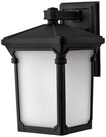
The light is going between the two garage doors right where the tree is in the picture below. It looks so bare with out the shutters. The original shutters were 14" wide, the new ones are 16" wide. I wanted 18" wide shutters and I thought that was what my husband ordered but apparently he didn't. The style of the old shutters was raised panel and the new shutters we got are louvered. The raised panel shutters made me think more colonial style house and to me didn't fit the house (and they were falling apart).

**I know that the mailbox, doorbell and house numbers are all different fonts. They will be away from each other and no one but me will notice (and yes it will drive me nuts). My husband wanted the "Ribbon" font for the address numbers and I really like the "0" in that font so I agreed (our house number is 700). I like the doorbell and it was cheap ($7.95), it is made out of black powder coat iron and if I don't like it I can get another one because it was so cheap. Others we were looking at were $45 and up.


